3 Tips to make your Web App accessible for the disabled
The Ultimate Tips

One main area that you should consider when designing is ‘Accessibility’. This is a design concept where especially people with disabilities are considered and a design is created that is usable and accommodates all potential users.
Any user interface design that you create must be universally accessible. Some countries have released rules and regulations to make sure that each and every design follows accessibility guidelines where if you do not follow these rules you will face legal implications. These rules are implemented to make sure that all users are treated equally and have a great experience without feeling overwhelmed when using these designs.
According to the World Health Organization, about 15% of the global population is affected by some type of Disability. This means over one million people are affected. Assistive technology is a technology that is used by individuals who have a hard time performing their tasks. Especially with Assistive Technology, “Accessibility” is used to focus on individuals with disabilities and their right to access to entities. People with disabilities face a lot of hardships to complete their day-to-day activities. There are mainly 5 types of disabilities that have an impact on User Interfaces,
- Reading Disabilities (Dyslexia)
- Visual Disabilities (Color Blindness)
- Cognitive Disabilities
- Motor Disabilities
- Hearing Disabilities
As you can see there are many types of disabilities that people go through. Over a billion people in this world suffer because of this. Therefore as a designer, what we can do is to make the hardships they face less and less by designing an interface that helps them to complete their necessary tasks.
3C’s Concept of Accessibility
Accessibility is one of the most important topics that we have to pay attention to. When I was researching this topic I got the opportunity to refer to many great articles.
And WCAG 2.1 Checklist-Guide to Accessibility by Daniel Schwarz, Designing for accessibility is not that hard by Pablo Stanley & All You Need to Know About Web Accessibility by David Gevorkian are the main articles I referred to when writing this blog article. Hats off to all the writers and bloggers who have put a tremendous effort to show the importance of accessibility. The resources I have referred to are mentioned below.
Thanks to all these articles I was able to dig deep and come up with my own concept which can be used when designing for accessibility. With the 3C’s concept I have addressed the accessibility issues and relevant solutions a designer can take to overcome them. I believe this concept would support immensely when designing for accessibility, especially for disabled users.
1. Color Contrast Accessibility
The Web Content Accessibility Guidelines (WCAG) mentions the specific guidelines that must be followed in order to provide the best user experience for all users around the globe. According to WCAG 2.0, there are 3 conformance levels of accessibility,
A: Essential — If this level is not met, the content may not be readable or fully operable.
AA: Ideal Support — This level is required for European Union Government and public body websites.
AAA: Ideal Support — This level is for parts of websites and web apps that serve a specialized audience.
You can find great examples in the following video,
A text that is larger, is easier to read at lower contrast. Vice versa, texts that are smaller with higher contrast are easily readable. The minimum font size and color contrast for test readability provided by WCAG are the following standards for a web page with regards to this concept are,
For normal text,
At least 12 point (16px) with Regular weight or heavier.
AA: 4.5:1 (minimum requirement)
AAA: 7:1 (recommended)For large-scale text,
At least 18 point (24px) or 14 point (18.66px) bold font size.
AA: 3:1 (minimum requirement)
AAA: 4:5:1 (recommended)
You can use color contrast to display crucial information. High contrast colors are always best to use for a design as it would be much readable for the users. But when choosing the colors to display the information you must also consider how people with vision impairment would see it. You can use colorblind-friendly graphs or tags when displaying this information.
When you are designing, you must always come up with a color theme that is suitable for it. This color theme you create must be convenient for all users and the content you use with these colors must be readable and organized. The colors must not be too bright and off-putting. The important and critical information must be displayed in high contrast. As mentioned by WCAG, the contrast ratios must range from 1:1 to 21:1. These contrast ratios can be checked practically with the use of plugins for Figma, Sketch, or Adobe XD where you can see how it looks like.
The first thing you should do when building a color theme is to review each color against the background color of your page by using an existing color scheme. You can draw a few squares and add different colors to check the contrast levels of each. You can even play around with the opacity to see which is the best. The stark plugin can be used to calculate the contrast ratio for it. This process does take some time but finally when you have a result that meets all accessibility guidelines and it will be a successful design that is convenient for your users.
Optimizing screen readers is one successful strategy that can be used. Text to speech functionalities that dictate the content of a page to visually impaired users has been quite useful and helpful. It is good practice to provide visual elements such as images, icons, or videos with alternative texts or a small description because then it would help visually impaired users to understand the content better.
Important Tools that would be helpful,
Color Oracle — Plugin for mac and windows
WhoCanUse — Web based app on browser
Stark — Plugin for Figma
Sources:
2. Clickable Area Accessibility
2.1 Add focus states for Button groups, Radio buttons, Checkboxes, Tabs & Input fields
The main aspect of action buttons is the Focus State. Focus states are a visual aspect that could be used to guide the user. This is useful for Keyboard navigation when the user is using the ‘Tab Key’ on the keyboard to navigate around the Interface. To let the user know where he is at the moment while navigating, you can use a shadow effect or a highlighted effect around the button for this.
Source: Focusing on buttons by Carlota Antón

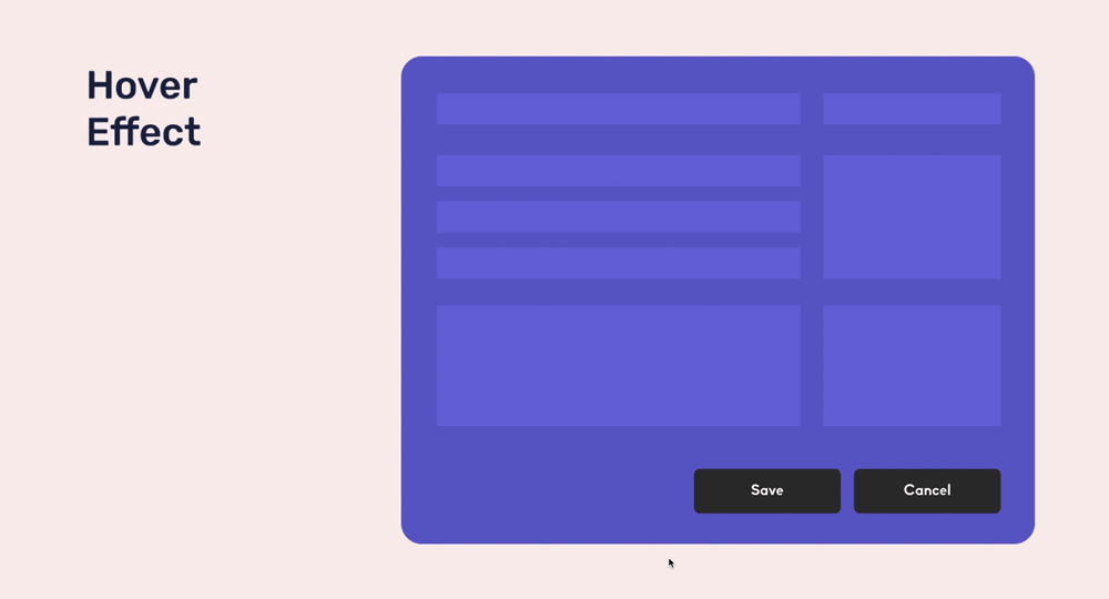
2.2 Always use hover effect on Web
This will be a useful effect on the user. You can add the hover effect to buttons or icons and this would be easy for users with cognitive disabilities. For any action button, you can use hover effects to let the user know which button he is about to click at the moment. You could change the contrast of the button color for both hovers. But these effects must be well differentiated. For example; the contrast can be lightened or darkened for hover.
2.3 Using Pressed Effect
It is good practice to use the ‘Pressed Effect’ so the user will know which button is clicked at the moment. This will be useful for users with cognitive disabilities as they are confirmed with what buttons they have pressed. You can display this confirmation by adding an animation to the button.

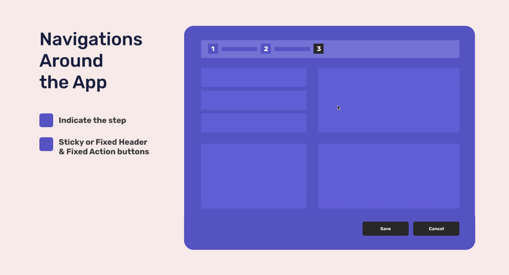
2.4 Navigations around the app should be easy to use
One way for users to quickly connect with a website or application is to provide excellent website navigation. It is important to use high contrast and style which is consistent from page to page.
In addition to this, you can use breadcrumbs/step indicators to help the user to know where he stands in the process on the website. For Example, in an instance like completing a purchase, you can help the user by showing each step he has completed and the steps he has left to do.
Consistency in navigation is another aspect you must focus on. Having a fixed header and footer with information useful to the user is a way to improve consistency.
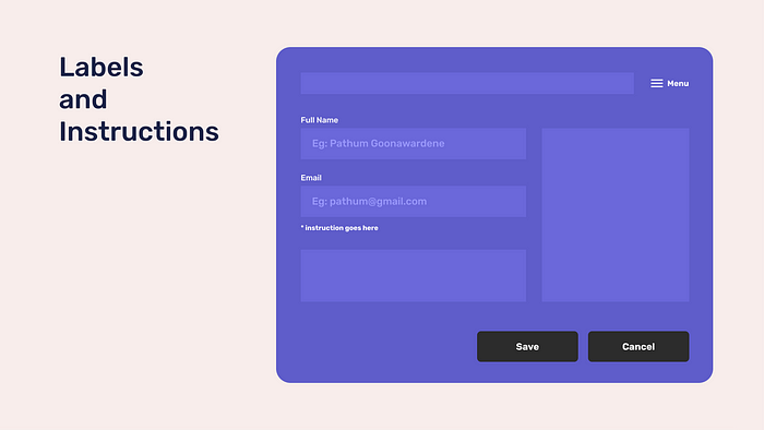
2.5 Use labels and instructions for Input fields and icons
One of the main mistakes a designer does is using placeholder text as labels for a form. This does give a nice minimalistic look for the form and it’s a new and modern trend used by many people. But this placeholder text is very low contrast and will be hard for a user with visual impairment to read. In addition to this, when the user selects the text box to type, the placeholder text will be replaced by what he types. It is good practice to always let the user know what they should type onto the form. If the labels go away when the person is filling an input and the user forgets what he should type, he must cancel everything he typed and look at the label again to remind what it was.
All the labels that are visible for the user should have high contrast colors with respect to the background color so it would be clear. In addition to this, you must provide time for the user to fill the form or complete any other task. This is useful for users who have cognitive disabilities. Repetitive alert messages can frustrate users who need time to read and understand the content to make a decision.
Source: Provide accessible labels and instructions by Harvard University Digitial Accessibility blog
3. Common Content Accessibilities
3.1 Optimize Typography
- The Rule of Thumb
For mobile applications, ‘The Rule of Thumb’ is a concept that is quite useful. This concept states principles that must be followed to organize a convenient layout as users of mobile applications use the thumb to interact with the application. In this concept, the font size provided is 16px for mobile applications.
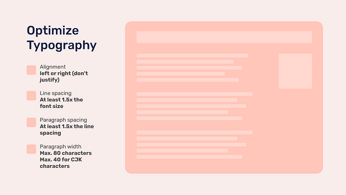
- Alignment
Alignment must always be used within a website. A content without alignment will look unfinished and would not be appealing to the user. You could use either center, left, or right align. It would be good if Justify alignment is not used for a website as according to David Kadavy, it would be harder for the user to read such content.
- Using proper line space
Line spacing is usually measured as a percentage with regard to the font size. Usually, it is used as 120%-145% with regards to the font size for line spacing. If knowing the percentage is hard for you, 120% is equal to 1.2em. This can be referenced through Approximate Conversion from Points to Pixels. Both too little and too much line spacing tends to be a problem in content. The ability for the user to read the content properly must be your main focused area in this.
- Use of paragraphs
When you have a lot of content on a page, break it down into several paragraphs with 70–80 characters within each so it would be readable for the user. Add line spacing within each sentence to make it even clearer. When dealing with paragraph spacing, the paragraph space is 1.5x the line spacing amount you have used in the content. When you optimize these concepts for your content, it will be very much convenient for the user to read it.
Source: WCAG 2.1 Checklist-Guide to Accessibility by Daniel Schwarz
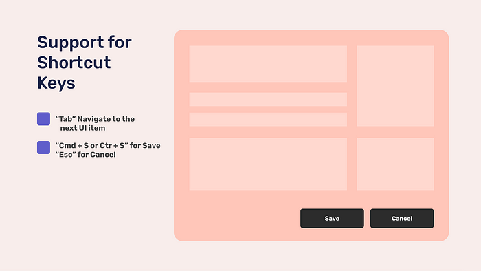
3.2 Support for Shortcut Keys
Accessibility for Keyboards is also an important factor that must be considered. Users who are affected by motor disabilities and visual impairments who rely on screen readers need the keyboard for navigational purposes. Keyboard shortcuts are one aspect that can be supported for a web page. Shortcut keys such as “Tab” to navigate to the next UI Item, Ctrl+S or Cmd+S to save, or even the “Esc” key to cancel are some shortcut keys that are mostly used. You can use a visual effect such as high contrast color or a glowing shadow to let the user know where he is at the moment on the web page. As the user navigates through the web page, you must design a logical order that makes sense for the user. Keyboard shortcuts must be supported for a website. Most users use the ‘Tab’ key to navigate within a web page.
Source: Keyboard Accessibility guidelines by WCAG
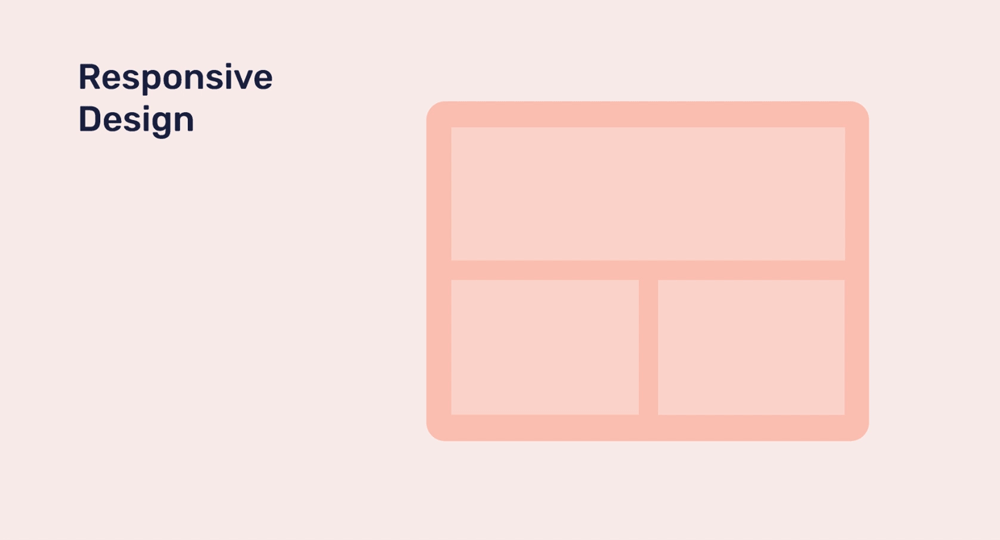
3.3 Responsive Design
Optimizing a design that adjusts the layout according to the device is one of the most useful aspects of a design. This is called a ‘Responsive Design’. The flexibility of the site is the key to make the user comfortable with the site. This will help to organize the content with respect to the Mobile and Desktop designs which is very convenient for the users.
Conclusion
When developing an application that is accessible to everyone, there are many things to consider. When you come up with a design that can be used by each and every person with ease, it shows that you care about all your users. As your users are the main priority for a designer, this concept will help to build trust between the user and the application.
References & Some useful resources for you!
World Health Organization — Disability and Health
Web Content Accessibility Guidelines (WCAG) —Font sizes and color contrast
The A11Y Project — Checklist for Accessibility Design
Tips for Designing Accessibility in Voice User Interfaces by Bo Campbell
An Accessibility Checklist for Designers and Developer by Serena Zheng
Accessibility guidelines for UX Designers by Avinash Kaur
6 steps to make sure the website you’re designing is accessibility compliant by Kriti Krishan
