Design Checkbox Web Component: All you need to know — Ep.3
What is a checkbox?
A square-shaped button is a checkbox. It is employed to show the user a list of options from which to choose. Multiple-choice questions typically use checkboxes, which implies that each checkbox is independent of the others and that selecting one will not affect another.
Source: About the checkbox component by U.S. Web Design System
Anatomy
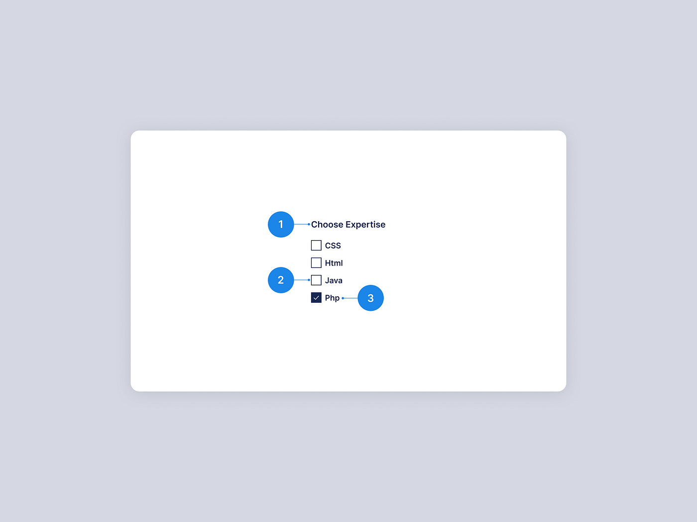
- Group label — The group label informs the user of the criteria used to make the selection. This is optional and may be added to help users get a better understanding.
- Checkbox input — The checkbox input represents the checkbox’s current status. It is in the unselected state by default.
- Checkbox label — Describes the data that the user is attempting to select or deselect.
Contents of a checkbox
Group labels
A group label may sometimes come before a series of checkboxes to help users understand the context. A checkbox list does not always need to have a group label. When checkboxes are embedded in large components that already have a group label, it is not required to provide the checkboxes with their own group label.
Checkbox labels
A label must be present on a check box. Each checkbox should have an individual label that is clear and concise. Labels are always displayed to the right of the checkbox.
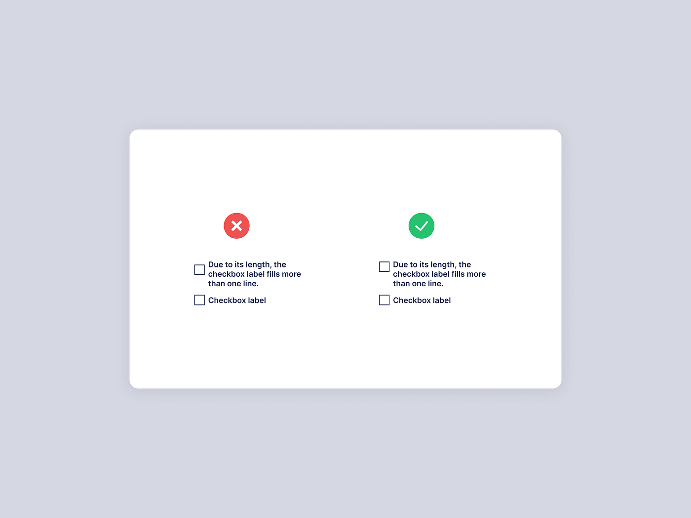
Overflow content
It is always preferable to keep the checkbox label length to three words or less. If your label is lengthier than necessary, try rephrasing it rather than turning it into an ellipsis. If you are unable to rephrase a lengthy label, continue on to a second line, but make sure the initial line of the label and checkbox are top-aligned.
Instances where checkboxes are used
These are the four most frequent instances where checkboxes are utilized.
Forms
When completing online forms, checkboxes must have appeared. For instance, a question like “Select your age group” would appear as a series of checkboxes, each representing a different age group from which the user would need to choose. One of the most frequent uses of checkboxes is in online forms.
Source: Checkboxes or radio buttons? Let the UI design battle commence! by Justinmind
Filters
Filters can make use of checkboxes. Checkboxes are commonly used on e-commerce websites to filter out various categories. Users can select the categories they want from the filter menu, and the items they select will come up in the search results page.
Data tables
In business organizations, a data table is a typical table that is used to hold information. Each set of information occupies a row in a data table, similar to ordinary tables, which also include columns and rows. Data tables can use checkboxes to select many rows of data to alter, update, or delete them all at once rather than having to repeat the same action repeatedly.
Source: What are date tables? by bartleby & Using Check-Boxes on Data-tables by Levi Baitelman
Terms and conditions
The usage of checkboxes in terms and conditions is common. You can agree or disagree with the terms and conditions by checking or unchecking it respectively.
Lists with selections
This checkbox is utilized when a parent checkbox is present, along with a list of checkboxes that are its children, below it. When the parent checkbox is selected, all the child checkboxes are also immediately selected. All of the list items would be deselected if the parent checkbox was unchecked. Users can individually check each item in the children’s checkboxes as well. This is called a nested checkbox.
Source: Flutter: Parent and child checkboxes — Part 1 by Nishanth Sreedhara
When not to use checkboxes?
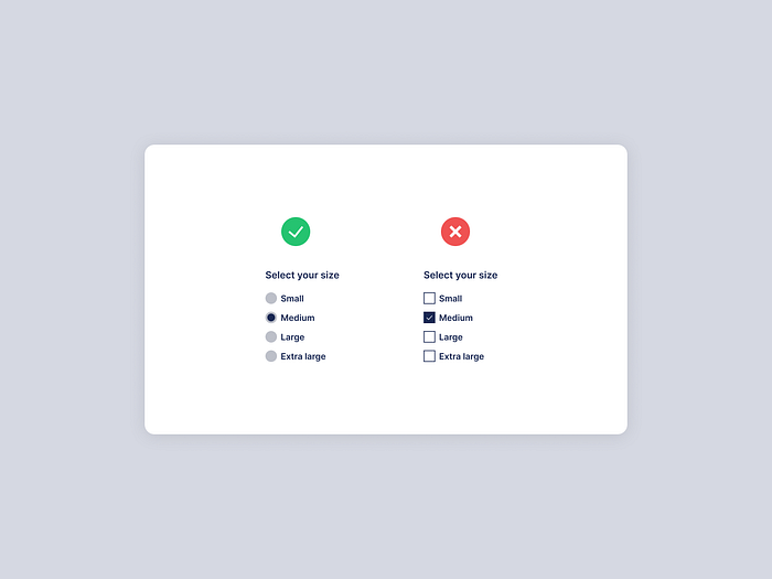
When users must choose just one option, radio buttons must be utilized rather than checkboxes. When compared to radio buttons, checkboxes allow users to choose numerous alternatives, while radio buttons only let them choose one.
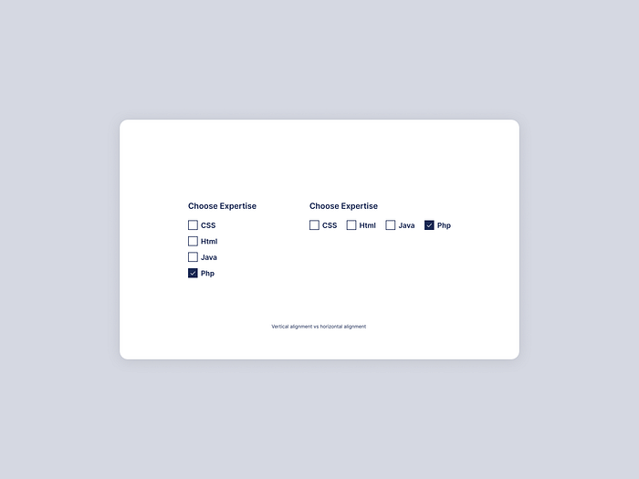
Alignment
The labels for the checkboxes are placed to the right of the checkbox. Each checkbox option in a group of checkboxes or a list of checkbox options may be arranged vertically or horizontally based on the overall user interface (UI). It is advisable to position the checkboxes vertically for easier reading.
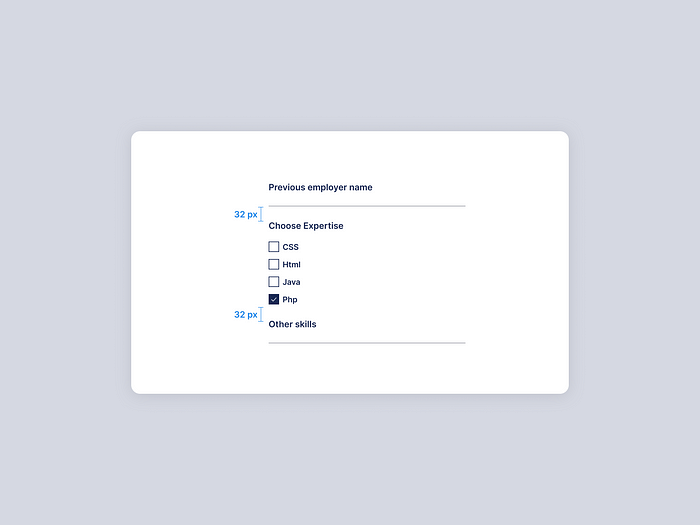
Spacings to consider when designing checkboxes
Checkboxes are most frequently used in forms, as was already indicated. There are numerous other questions on the form, including checked choices. It is always preferable to leave a 32px gap above or below the following component. In cases when there is a space restriction, 24px or 16px can be used. The horizontal distance between a check box and its label should be at least 8 pixels.
States of a checkbox
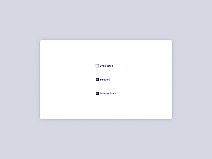
A checkbox has three main states as follows:
- Unselected — This is the checkbox’s default setting, where no option is selected.
- Selected — When a user selects a checkbox, it is in the “selected” state when a tick mark appears inside of it.
- Indeterminate — A checkbox that has a parent-child connection will display this state. When a single or a small number of the child checkboxes are selected, the parent checkbox becomes indeterminate.
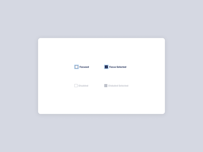
A checkbox, like all other components, also has a focused and disabled state in addition to the states mentioned above.
Source: Introducing the Three State Checkbox by Carson Ford
Accessibility
Keyboard interaction
The “Tab” key should enable access to each checkbox, and the “Space” key should enable the selection of an option.
Mouse interaction
Clicking a checkbox or its label will select or deselect the checkbox. It is crucial to make the checkbox and label interactive in order to increase user accessibility to the clickable target. The mouse pointer’s shape changes when the mouse is over the target, which is the only hover effect a checkbox will have.
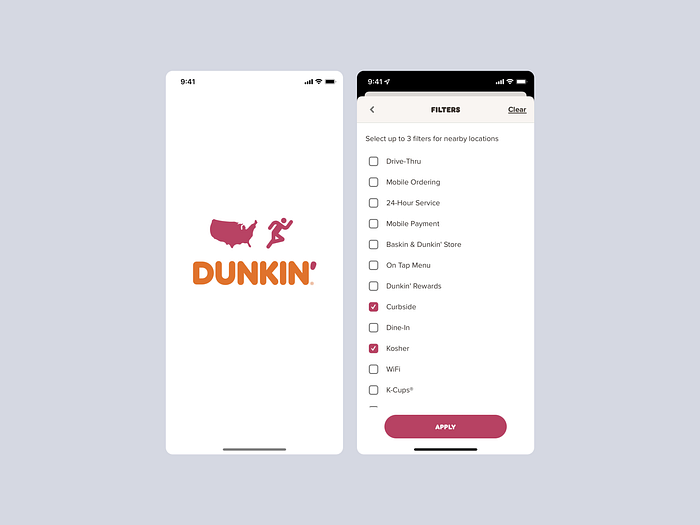
Here are some real-world examples where checkboxes are used
Dunkin
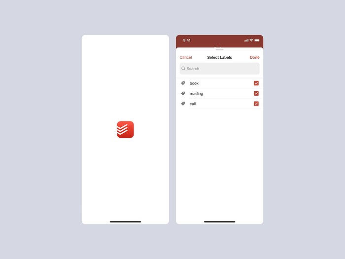
Todoist
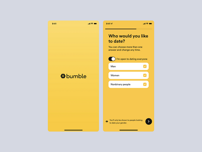
Bumble
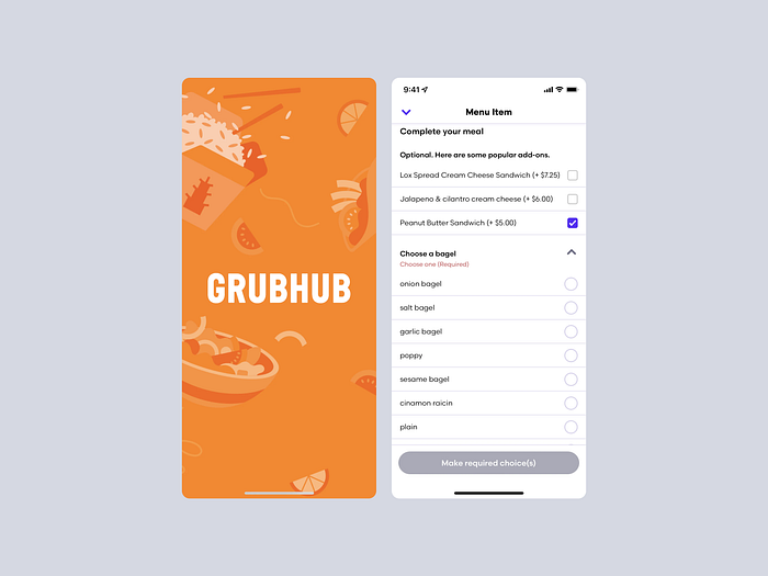
Grubhub
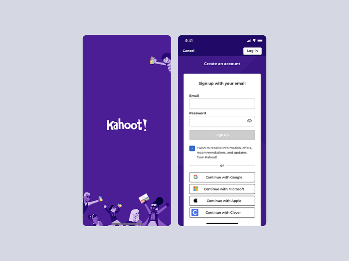
Kahoot
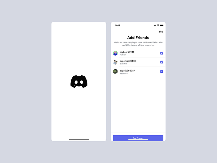
Discord
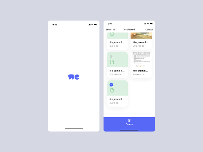
We Transfer
Conclusion
Checkboxes are an unambiguous approach to letting users know they can choose one or more answers to a question or items from a list. Additionally, checkboxes make it simple for users to “uncheck” a choice, which might be challenging with other selection techniques on a form such as radio buttons or select menus. Checkboxes frequently have “check all that apply” instructions to let users know it’s acceptable to choose more than one item at once.
Here are some useful resources for you
Source: About the checkbox component by U.S. Web Design System
Source: Checkboxes or radio buttons? Let the UI design battle commence! by Justinmind
Source: What are date tables? by bartleby
Source: Using Check-Boxes on Data-tables by Levi Baitelman
Source: Flutter: Parent and child checkboxes — Part 1 by Nishanth Sreedhara
Source: Introducing the Three State Checkbox by Carson Ford
